Playground
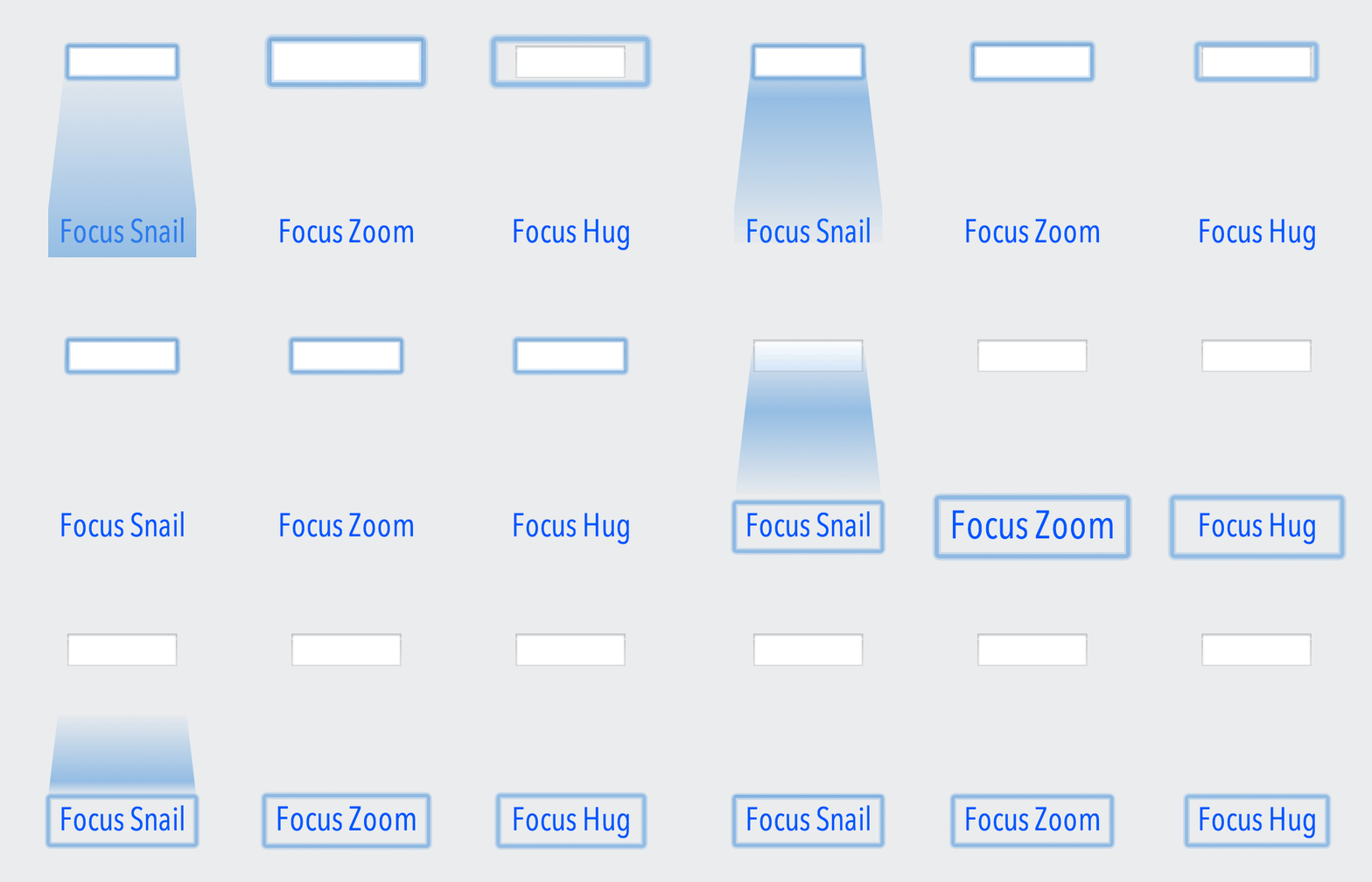
I performed 3 experiments to address some of the problems of Flying Focus.
Focus Snail
Flying Focus received good critique on Hacker News.
This demo seems to move faster than eye tracking speed, and the animation appears to skip or flicker, and it go [sic] too fast to follow, especially if the widgets are far apart.
True. I tried to increase animation duration but it seemed dull. Focus Snail doesn’t have this problem since it leaves a “trail”, which becomes longer for controls that are spread out, thus easier to notice.
Focus Zoom
Good idea, but the particular visualization (moving shadow) is a bit annoying. I would go with something less in-your-face. Maybe a light shadow that blinks couple of times on focus? I don't think the directional aspect of this is very important. Users just need to know where the focus is now, not where it came from.
I agree, but I don’t like the blinking shadow idea. I experimented with Focus Zoom, which magnifies the focused element then gradually returns it to its original size.
Focus Zoom uses CSS transforms that unfortunately don’t work with inline elements, which led me to my next experiment:
Focus Hug
This prototype only changes the size of the focus box, keeping the size of the focused element intact. It’s not as aesthetically appealing as Focus Zoom, but it works well with inline elements.
Install
All three scripts are on GitHub: Focus Snail, Focus Zoom, Focus Hug.
Focus Snail is also available as a Chrome extension.
Disclaimer
I hope my experiments will serve as inspiration to implement similar effects on an OS level. I implemented the prototypes using web technologies such as CSS, JS, and SVG (for Focus Snail) only because those are tools I’m familiar with. There is no real reason to just limit them to the web.